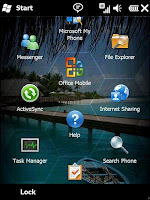
It’s been long overdue and at long last Microsoft has redesigned the Windows Mobile interface. No doubt users will like the honeycomb layout and the Zune-like feel. There’s more to like with no-waiting voice mail, cloud-syncing MyPhone online service, and a new app store. Hey, where have I heard this before?
Things are not only meant to be finger friendly, but are designed to be used with one hand. The design on some of the screens has clearly been inspired by Windows Media Center and much of the information can be accessed by simply swiping up/down, left/right.
About time. The real test is everyday use, but it looks promising in many ways. Looks like its up to the app writers now.
Monday
- Windows Mobile 6.5 OS unveiled
Subscribe to:
Post Comments (Atom)


 Web Directory - Backlinks free
More File


No comments:
Post a Comment